When I was tasked with creating a brand identity for Lettering on the Cheap, my employer Shane Willems spoke loud and clear; give our audience a do-it-yourself home for their projects. There is real logic behind his statement and it provided the basis for all designs moving forward. But how could a Custom Vinyl company become a DIY hub?
"People Don't care about our products, they care about what they're applying their vinyl to." ~ Shane Willems
Shane wasn't wrong, he just needed a little help getting his business elevated to the position he knew it could become. So I went to work with our lead designer Tyler Rolfe and we came together to expand upon the hard edged design of LOTC and turn it into something friendly, clean and motivating.
DESIGNING THE DIY LOGO
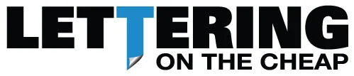
The old LOTC logo was a good place to start, the colors were dark and the fonts firm, cold and fairly masculine. Tyler took the lead and developed the inspiring logo you can see at the head of the article, slightly angled with a warm inviting typeface. The swing of the 'L' made for a charming handwritten feel to exemplify the DIY feel the brand was becoming.
The next step however, was for me to create an animated version of this logo for our videos or visual media. This presented the next challenge- how do I capture the DIY feel?

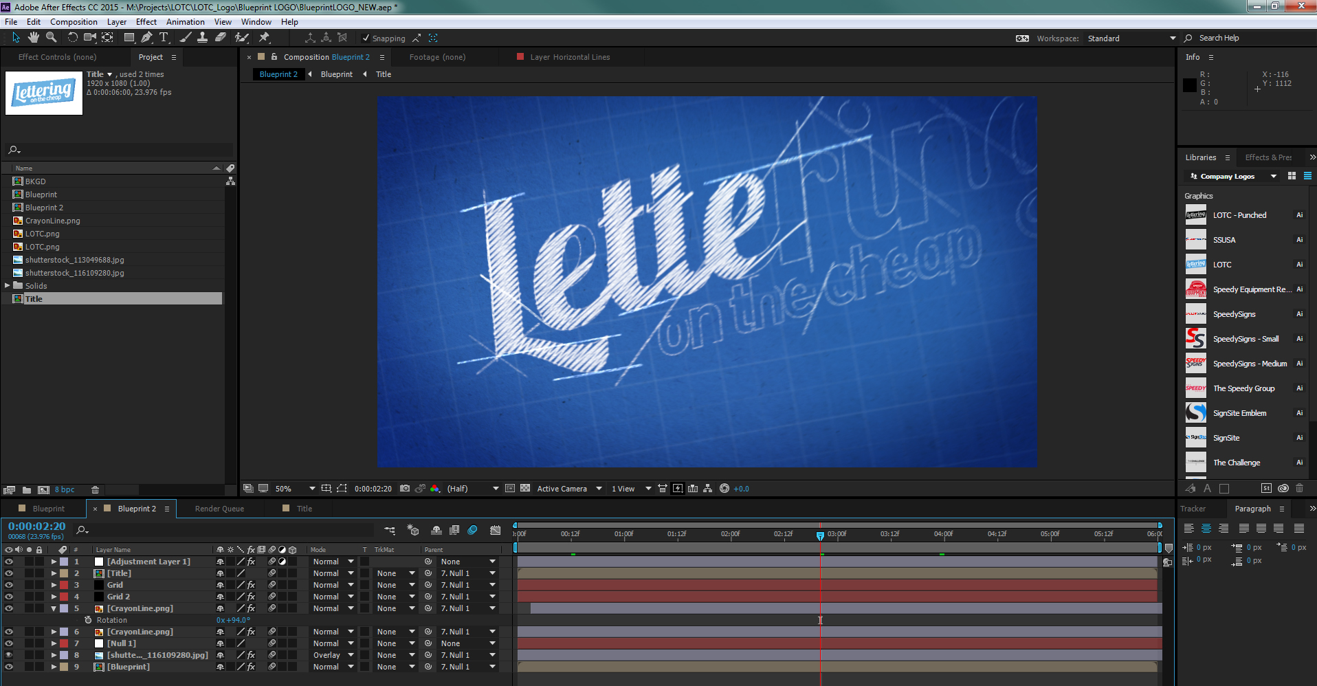
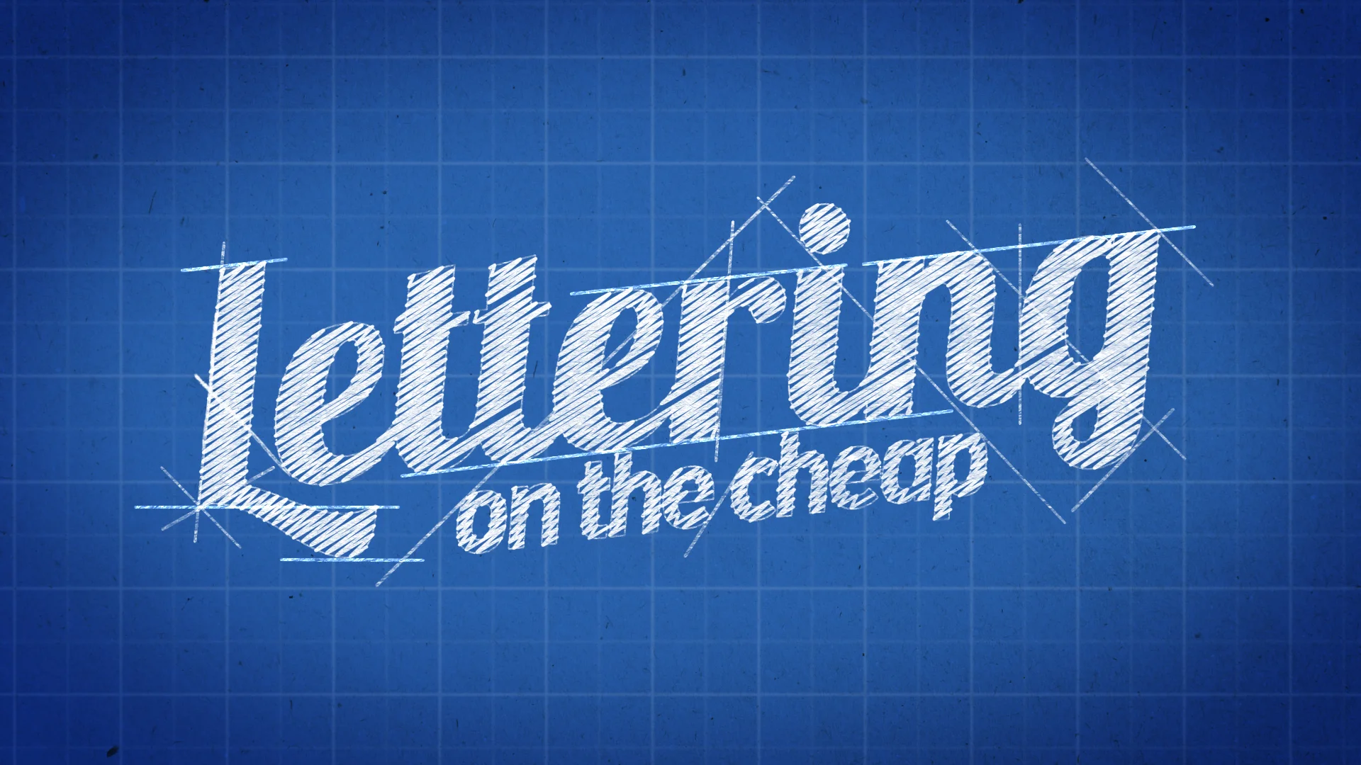
The idea occurred to me that all good plans start on paper and so to should LOTC. The animated logo would draw itself on screen as if being designed before your eyes on a blueprint sheet. This would then transition into the final logo Tyler Rolfe designed. Using Adobe After Effects the logo slowly but surely took shape. The hardest part of designing something like this, happened to be the 'design lines' you can see in the example above. Careful attention had to be made into the number and angle of the lines; too many made the logo look too overburdened and confusing, too few and you'd lose sight of the point.
In the end, the logo was created exactly as envisioned and captures the look and feel of the DIY community.
FLESHING OUT THE DIY VIDEO
Next, the videos themselves needed to be properly developed to convey the same message, but in a much more standardized template that could be used repeatably for numerous videos.
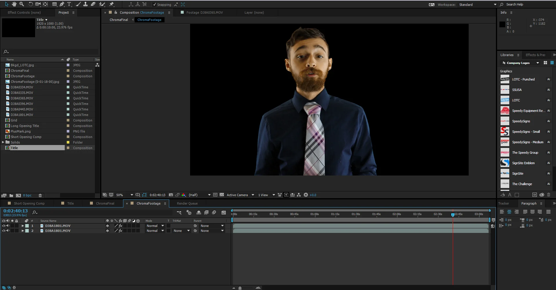
To start, each video was condensed as much as possible, to offer the viewer as much information as possible, but in a managle short timeframe. The host was tasked with wearing a blue shirt to emphasize the brand's theme and was asked to come off as warm, welcoming and knowledgable.
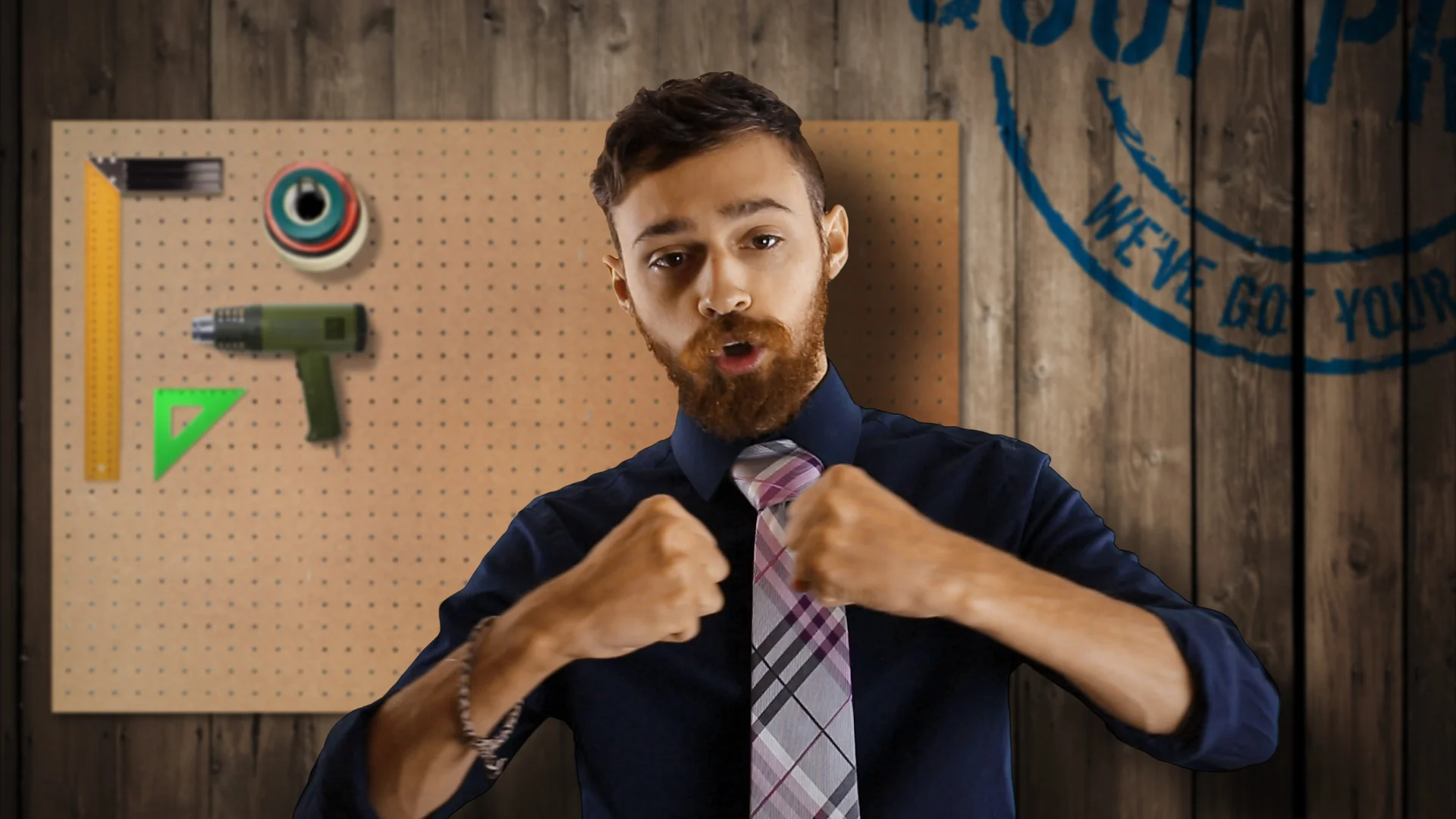
As production continued a work bench was added digitally to the background along with the slogan "We've got your back", a critical component in the LOTC branding. The tools on the 'wall' were carefully selected as they would be tools the customer is expected to use when applying the products LOTC sells.
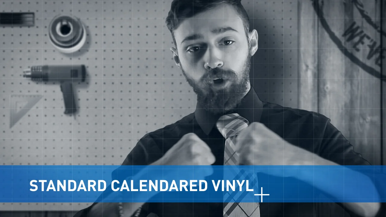
THE DIY OPENING
To open the videos I decided to hone in on the DIY image LOTC was cultivating. This was achieved in a number of small ways. For example, a light grid network was placed over the static image at the start of the video, the brand's sharp blue was incorporated into the lower third's title bar and an animated mark was added to reveal the text.
These videos are tied together by the strong emphasis on the brand's identity as a DIY hub for all things Vinyl. The opening relates closely to the body of the video, which is capped by the blueprinted company logo at the end. I've been very happy with the production of these videos and the identity I helped forge along with Tyler Rolfe and Shane Willems.