
When I was tasked to create videos for Speedy Equipment Rental's I was honestly a little uneasy about the whole thing.
No, it wasn't simply against rental companies. It was because our designer put together the logo and general 'feel' of the brand rather quickly. Many of the design elements were meant to only exist in the 'meantime' until something better could be organized. But that's how design life goes at times, especially when you're managing other, more important brands under the same umbrella.
So here was my problem. How would I go about creating a Video Template for this brand if I wasn't sure the actual design itself would remain the same? The company logo was a good place to start and had the most time put into it. The company colors are simple, red and white; complemented with black when needed.
CREATING THE DESIGN
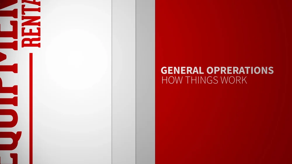
To start, I began work on the opening clip that would introduce the follow up videos. Forced to keep things fairly simple I decided to pull elements from the logo itself into the opener. As you can note, the title 'Equipment Rentals' makes an appearance along with the red hue in which we commonly see the logo displayed as.
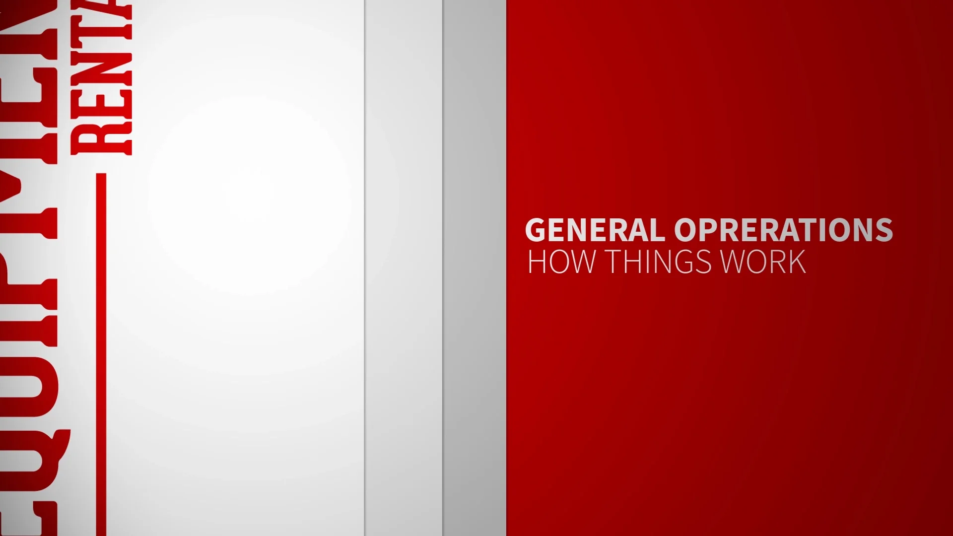
The font is Gotham, which I previously worked with on the SSUSA project and have since fallen in love with. But the font works well here, keeping to the simple design that organically can match whatever SER turns into- in the future. Keeping in mind my previous work with SSUSA the SER opener also takes some visual cues from this success and in my mind does a slightly better job at keeping the look clean and minimalistic.
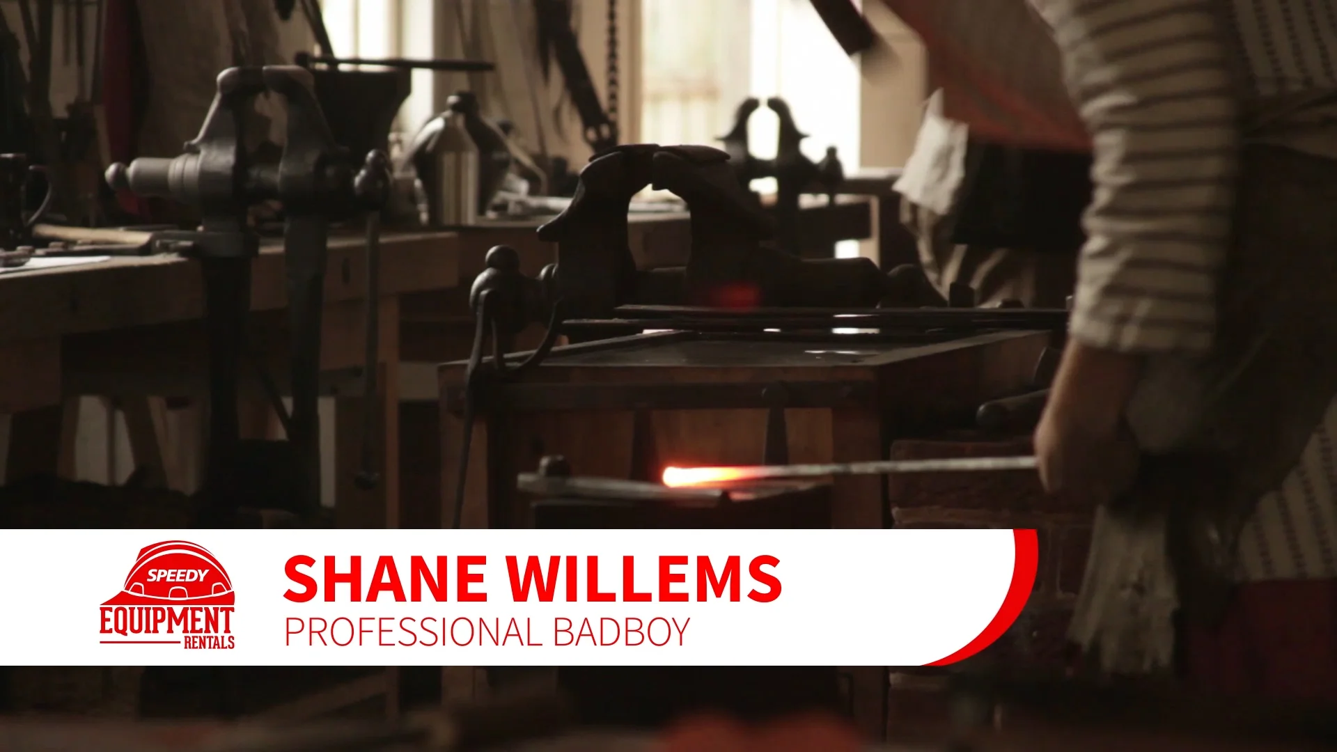
As the videos will continue, if a host is present a lower third card will slide out; revealing the name and title of whomever is on screen. I kept the title card a little fun with a slight swirl of the logo, but ultimately kept to the clean design the previous opener founded itself on.
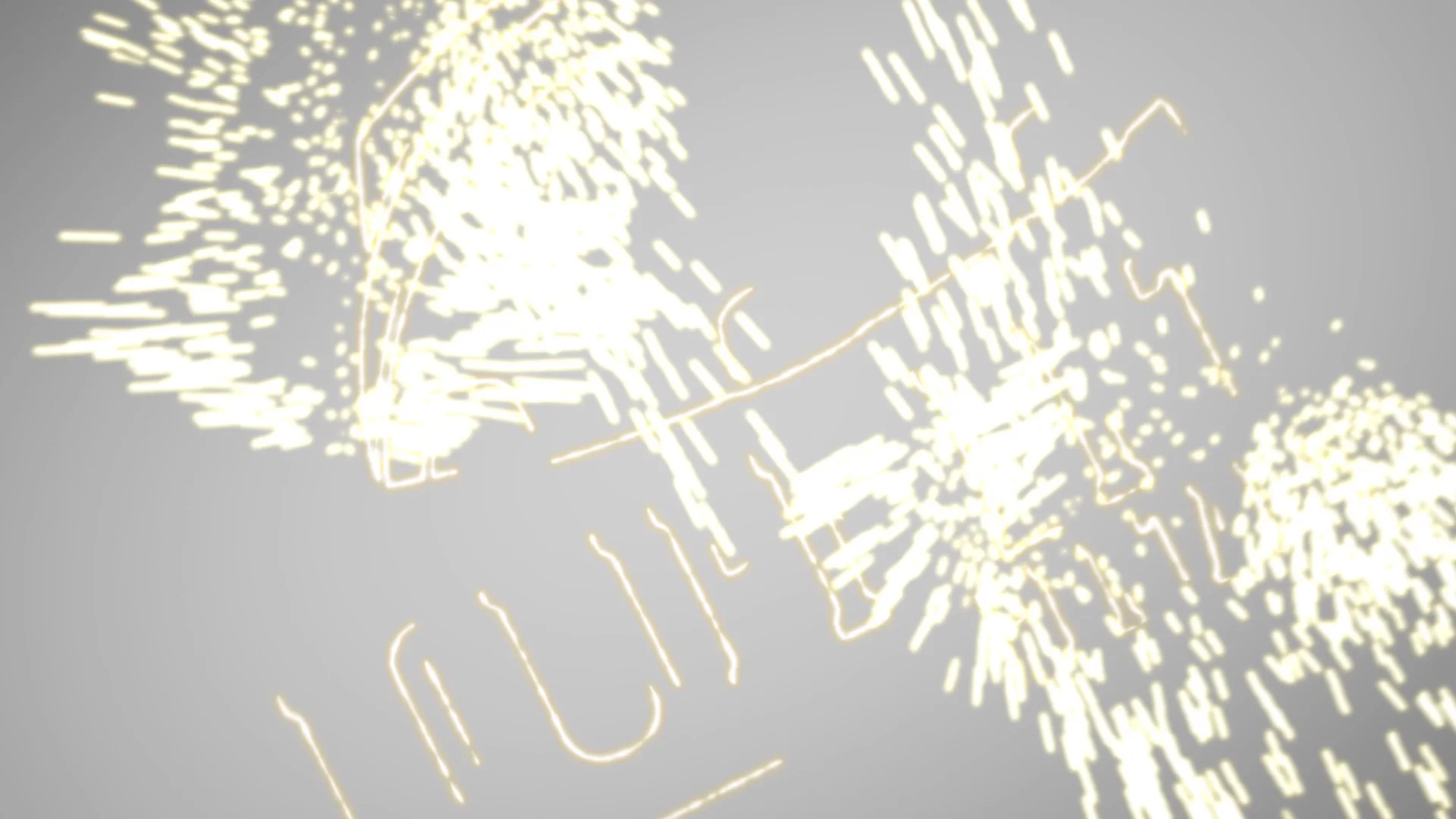
The closing was honestly the hardest part and I played around with a number of different designs. None of which really panned out the way I wanted- the problem was I was lacking any real inspiration. I wanted the closing logo to take on a rugged "We get things done" type of look and I loved the idea of welding sparks.
It would take a number of revisions throughout the day to really capture what I was looking for. But in the end I believe it worked out beautifully. You can watch below the sample of the video effects for SER. Leave your comments and tell me what you think!
